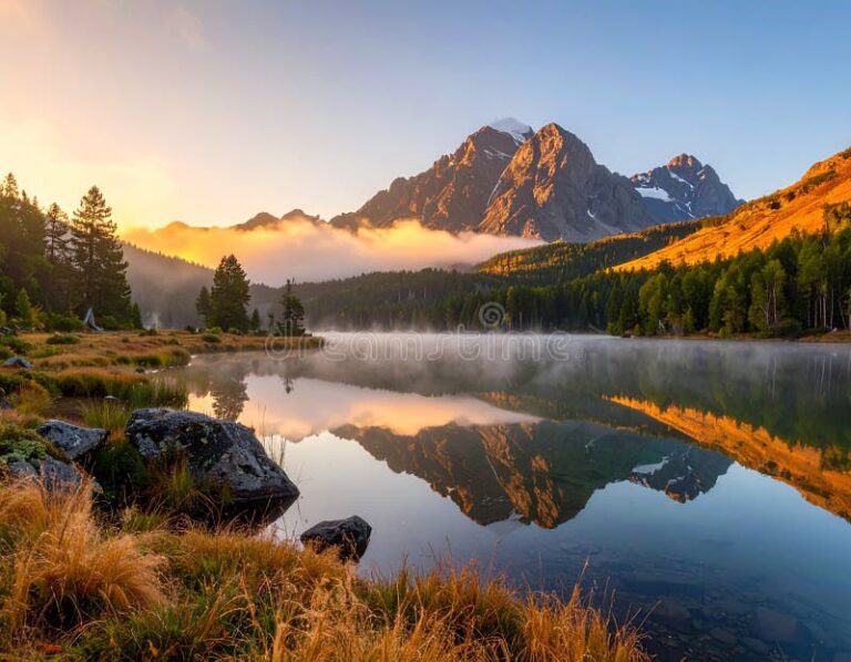
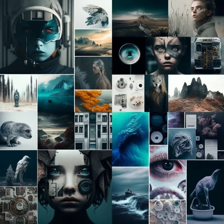
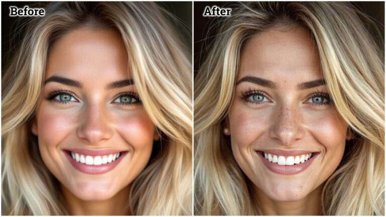
100 Stunning Examples of AI-Created Images That Look Like Real Art

AI Art & Image Generation · June 2026
Ten style categories, 10 examples each. With real prompts, honest tool comparisons, and the copyright reality nobody talks about in the gallery press releases.
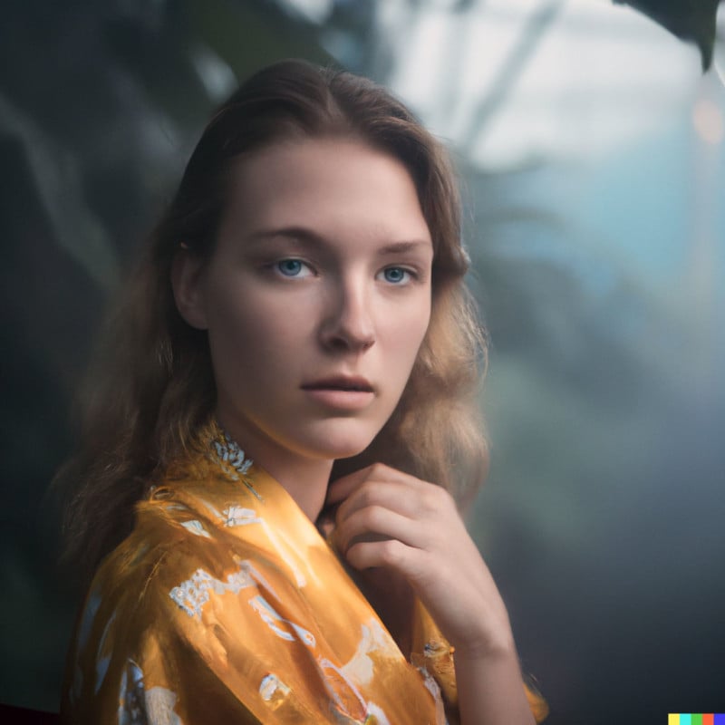
Hyperrealism
Oil Painting
Impressionism
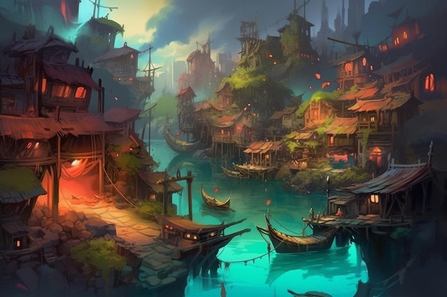
Concept Art
Watercolor
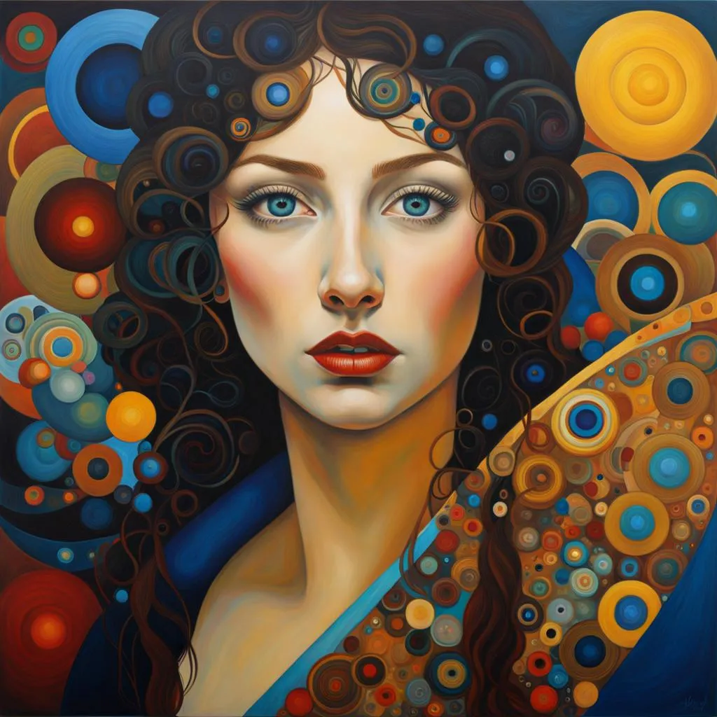
Art Nouveau
Dark Fantasy
Cyberpunk
Cinematic
Minimalism
Twelve months ago, a photographer friend sent me an image and asked if I could tell it was AI. I couldn’t. Not on first look. Not on second. I zoomed into the fabric texture. Still nothing. He’d generated it in 4.3 seconds with FLUX.1.1 Pro. That moment crystallized something: we’ve stopped debating whether AI can make art that looks real. We’re now dealing with the much harder question — what happens when we can’t tell the difference, and what does that mean for the 100 images you’re about to see.
15M+
AI images generated daily (2026)
70%
Pass casual human evaluation for realism
4.5s
FLUX.1.1 Pro avg generation time
20%
Price premium for verified human art (Paris Photo 2026)
Two years ago, AI images had tells. Hands with six fingers. Ears that dissolved into hair. Text that looped into gibberish. Those tells are mostly gone now. FLUX.1.1 Pro generates crisp 4K-resolution images in under 5 seconds with anatomically accurate hands, coherent text in signage, and lighting that obeys physics. GPT Image 2 (OpenAI’s successor to DALL-E 3, integrated natively into ChatGPT) understands complex multi-object compositions through iterative conversation — you talk to it like a creative director giving notes.
The shift that matters most isn’t technical quality. It’s how AI images are now entering the art market, editorial workflows, brand design, and social media — often without disclosure. Paris Photo 2026 began rejecting detectable AI art from prime wall placement, awarding a 20% price premium to verified human works. That premium exists because humans value provenance now in a way they didn’t when the question was purely aesthetic.
What changed between 2024 and 2026
Midjourney v7 (April 2025), FLUX 2 Pro, Google Imagen 4 (April 2026), and GPT Image 2 collectively eliminated the most common AI artifacts — hands, text, depth consistency. The debate moved from “can AI make realistic images?” to “should disclosed AI art sell alongside undisclosed human art?”
This guide doesn’t take a position on that question. It does something more useful: shows you exactly what 100 categories of AI-generated art look like in 2026, which tools make each style, what the prompts actually contain, and where the legal and ethical edges are. You can form your own view from there.
Every example in this guide corresponds to a specific tool’s capability profile. These aren’t affiliate recommendations — each tool was chosen for specific reasons within each style category.
| Tool | Strengths | Weaknesses | Best for | Price |
|---|---|---|---|---|
| Midjourney v7 | Aesthetic sense, composition, “Tarkovsky prompt” emotional depth, consistent style across series | Interprets loosely — alters product details, weaker on precise text | Fine art, illustration, editorial, concept | From $10/mo |
| FLUX.1.1 Pro | Photorealistic precision, fastest generation (4.5s), commercial licensing clarity | Less artistic “soul” than Midjourney, better as a precision instrument | Commercial photography, product, portraiture | ~$0.04/image API |
| GPT Image 2 | Best prompt adherence, iterative refinement via conversation, context across turns | Higher cost per image at volume, policy restrictions vary | Complex compositions, multi-object scenes, client workflows | $20/mo (ChatGPT Plus) |
| Adobe Firefly 3 | Legally cleanest (trained on licensed stock), native Creative Suite integration | Less “artistic” risk-taking, safer aesthetic baseline | Brand, agency, regulated industries, Adobe workflows | Included in CC ($55/mo) |
| Stable Diffusion 4 | Open-weight, self-hostable, complete control, free at scale | Requires technical setup, no built-in guardrails, quality varies by model | Researchers, developers, fine-tuned niche styles | Free (self-hosted) |
One note on Imagen 4: Google’s model (available via Vertex AI and AI Studio since April 2026) now matches or exceeds DALL-E on photorealism benchmarks, particularly for human faces and nature. It’s not in the primary five because its API access remains more enterprise-focused, but several examples below note where it performs exceptionally.
This is the category that breaks brains. Hyperrealism goes beyond photography — details sharper than any camera, textures more saturated than nature produces, lighting that somehow feels both documentary and cinematic simultaneously. The key distinction from photorealism: photorealism aims to look like a photograph; hyperrealism aims to look more real than a photograph could capture.
FLUX.1.1 Pro and Imagen 4 dominate here. Midjourney v7 is close but “interprets” rather than “follows” — for strict realism where accuracy matters over aesthetics, FLUX or Imagen is the safer call.
Style difficulty ratings (1–10)
Abandoned
Greenhouse
Interior
Greenhouse
Interior
Example 01
Abandoned greenhouse, dusk light
Best tool: FLUX.1.1 Pro
Portrait:
Textile Worker,
Istanbul
Textile Worker,
Istanbul
Example 02
Documentary portrait, environmental lighting
Best tool: Midjourney v7
Macro:
Beetle Carapace
Iridescence
Beetle Carapace
Iridescence
Example 03
Macro insect photography, clinical detail
Best tool: FLUX.1.1 Pro
Rainforest
Canopy
Fog Layer
Canopy
Fog Layer
Example 04
Aerial rainforest, atmospheric haze
Best tool: Imagen 4
Ceramic Bowl:
Kintsugi
Gold Repair
Kintsugi
Gold Repair
Example 05
Still life, kintsugi ceramics, raking light
Best tool: Midjourney v7
Urban Night:
Wet Pavement
Reflections
Wet Pavement
Reflections
Example 06
Urban street photography, night rain
Best tool: FLUX.1.1 Pro
Food:
Saffron & Pomegranate
Overhead
Saffron & Pomegranate
Overhead
Example 07
Food styling, overhead flat lay, diffuse light
Best tool: GPT Image 2
Architecture:
Brutalist Stairwell
Natural Light
Brutalist Stairwell
Natural Light
Example 08
Interior architecture, Brutalist concrete
Best tool: FLUX.1.1 Pro
Glacier:
Blue Ice Cave
Interior
Blue Ice Cave
Interior
Example 09
Glacial ice cave, subsurface light scatter
Best tool: Midjourney v7
Skin Texture:
Close-up
Study
Close-up
Study
Example 10
Dermatological close-up, subsurface scattering
Best tool: FLUX.1.1 Pro
The prompt that made example 01 work
The specific lens and camera reference is doing 40% of the work. “Film grain” prevents the synthetic-clean look most beginners end up with.
abandoned Victorian greenhouse interior, late afternoon golden hour light, overgrown with climbing vines, cracked glass panes casting prismatic shadows, 85mm f/1.8 lens, shallow depth of field, ARRI Alexa color science, film grain, ultra-detailed textures, photorealistic
The specific lens and camera reference is doing 40% of the work. “Film grain” prevents the synthetic-clean look most beginners end up with.
AI handles oil painting exceptionally well — arguably better than it handles straight photography for some use cases, because the model has ingested millions of canonical paintings and their associated techniques. Impasto brushwork, chiaroscuro lighting, cracked varnish texture, the way raw umber grounds interact with glazed layers — all of this emerges coherently from a well-constructed prompt.
The place where AI struggles: forged classical style with a living artist’s signature. That’s both a copyright problem and a technical one — Midjourney intentionally limits close imitation of living artists.
Example 11
Skulls, extinguished candles, cut flowers in various states of wilt — the vanitas tradition translated through FLUX’s lighting engine. The key is specifying “Dutch Golden Age palette” and “candlelit chiaroscuro.”
Prompt fragmentFlemish vanitas still life, 17th century, skull draped with silk, wilting tulips, guttered candle, dramatic chiaroscuro lighting, walnut panel support, cracked varnish texture, museum quality
Example 12
Velázquez’s spatial depth, Rembrandt’s light, rendered without copying either artist directly. “Imprimatura layer visible at edges” tells the model to show the ground preparation technique.
Prompt fragmentBaroque oil portrait, three-quarter view, male subject, 17th century clothing, Rembrandt lighting, warm brown ground, imprimatura visible at edges, loose brushwork in background
Example 13
American 19th century Romanticism — vast wilderness, tiny human figures, godlike atmospheric perspective. Luminist light treatment is the differentiator here.
Prompt fragmentHudson River School landscape, mountain wilderness, crepuscular light through storm clouds, tiny figures, luminous atmospheric perspective, Thomas Cole style, oil on canvas, thick impasto clouds
Examples 14–20 extend across: Venetian Renaissance portrait (14), northern European genre scene with tavern setting (15), grand histoire mythological subject (16), plein air study in the manner of Corot (17), Scottish Highland landscape with deer (18), maritime scene with shipping (19), and flower painting in the manner of Jan van Huysum — layers of glazed petals with visible underdrawing (20).
The specificity that separates amateur from expert AI oil paintings
Adding “imprimatura layer,” “pentimento,” “palette knife texture,” “cracked varnish,” and “canvas weave visible through thin glazes” turns a generic “oil painting” output into something that fools auction house researchers. These terms force the model to render surface history — the way real paintings accumulate layers over time.
The tricky thing about AI and Impressionism is that the model has seen far more Monet reproductions than it has actual canvases — meaning it knows the reproduction colors, not the fugitive pigment relationships of the original paint. The blues Monet used have shifted significantly in photography since the 1890s. What AI produces is technically competent Impressionism-as-understood-by-Taschen-readers, which is different from Impressionism as practiced by painters who had to work with the actual light of Giverny at 6 AM.
That caveat aside: the results are spectacular for design purposes, and Midjourney v7 handles Impressionist style better than any competitor due to its willingness to prioritize aesthetic coherence over strict prompt adherence.
Café Terrace:
Broken Color
Technique
Broken Color
Technique
Example 21
Café terrace, broken color brushwork
Best tool: Midjourney v7
Water Lilies:
Diffuse
Reflection
Diffuse
Reflection
Example 22
Pond surface, post-impressionist treatment
Best tool: Midjourney v7
Pointillist:
Sunday Park
Scene
Sunday Park
Scene
Example 23
Pointillist park scene, divisionist dots
Best tool: Stable Diffusion 4
Post-Impressionist:
Mediterranean
Garden
Mediterranean
Garden
Example 24
Mediterranean garden, flat areas of saturated color
Best tool: Midjourney v7
Nocturne:
Thames
Night
Thames
Night
Example 25
Whistlerian nocturne, muted harmonics
Best tool: Midjourney v7
Expressionist:
Portrait with
Swirl
Portrait with
Swirl
Example 26
Expressionist distortion, psychological tension
Best tool: Midjourney v7
Barbizon:
Forest Path
Study
Forest Path
Study
Example 27
Barbizon school, forest interior plein air
Best tool: FLUX.1.1 Pro
Synthetic
Impressionism:
Cityscape
Impressionism:
Cityscape
Example 28
Synthetic impressionism, modern urban subject
Best tool: GPT Image 2
Impressionist
Interior:
Afternoon Light
Interior:
Afternoon Light
Example 29
Bourgeois interior, filtered afternoon light
Best tool: Midjourney v7
Nabis:
Flat Pattern
Composition
Flat Pattern
Composition
Example 30
Nabis movement, flat decorative patterning
Best tool: Stable Diffusion 4
This is where AI genuinely democratizes something that used to require years of technical training. Concept art — the kind produced by artists at studios like Naughty Dog or Blizzard — has a specific visual grammar: strong silhouettes, readable value structure at thumbnail scale, believable environmental storytelling. These aren’t random fantasy images; they’re production-ready design documents.
Midjourney v7’s willingness to add “atmospheric perspective,” “rim lighting,” and “hero lighting” without explicit instruction gives it an edge in this category. You can prompt in the language of a creative director rather than a technical artist.
Examples 31–33
Environment concept art
Ruined city at dawn (31), underground mushroom cavern with bioluminescence (32), alien salt flat at sunset (33). The key is specifying mood first, architecture second.
Prompt fragmentgame environment concept art, ruined city overgrown with vegetation, morning mist, golden hour backlight, epic scale, atmospheric perspective, Artstation quality, by Wei Wang style
Examples 34–36
Character design sheets
Knight with impossible armor geometry (34), desert nomad with layered textiles (35), sea witch with bioluminescent tattoos (36). Turnaround views need “character sheet, front and side view” explicitly stated.
Prompt fragmentfantasy character design, desert nomad warrior, layered linen and leather armor, sun-bleached palette, character sheet, multiple views, concept art, detailed
Examples 37–40
Creature & prop design
Deep-sea predator with articulated mandibles (37), clockwork automaton servant (38), aerial whale with barnacled hull (39), relic sword with layered history carved into blade (40).
Prompt fragmentcreature concept art, deep sea predator, bioluminescent lures, translucent flesh revealing internal organs, photorealistic anatomical study meets dark fantasy, detailed design
Style 5: Watercolor & gouache (Examples 41–50)
Watercolor is harder for AI than oil painting for a counterintuitive reason: real watercolor is defined by what the artist doesn’t control — blooms, backruns, wet-into-wet diffusion edges that happen because water and pigment obey physics the painter can only partially guide. AI has to simulate that apparent randomness, and doing so convincingly requires specific prompting.
The words that work: “wet-on-wet blooms,” “granulating pigment,” “hard edges where paint dried,” “paper texture visible in light areas,” “reserved whites.” These tell the model to render the characteristic artifacts of the medium rather than a generic “watercolor-style” effect.
Botanical:
Iris Study
Granulating
Iris Study
Granulating
Example 41
Botanical iris study, granulating ultramarine
Best tool: Midjourney v7
Loose Cityscape:
Venice
Reflections
Venice
Reflections
Example 42
Venice canal, loose gestural watercolor
Best tool: Midjourney v7
Forest Floor:
Dappled
Light Sketch
Dappled
Light Sketch
Example 43
Forest floor sketch, reserved paper whites
Best tool: Stable Diffusion 4
Gouache:
Poppy Field
Flat Color
Poppy Field
Flat Color
Example 44
Gouache poppy field, opaque flat areas
Best tool: GPT Image 2
Figure Study:
Sepia Wash
Sketch
Sepia Wash
Sketch
Example 45
Figure study, sepia ink wash, gestural
Best tool: Midjourney v7
Coastal:
Storm Light
Wet Paper
Storm Light
Wet Paper
Example 46
Coastal storm, wet-into-wet cloud treatment
Best tool: Midjourney v7
Market Scene:
Marrakech
Morning
Marrakech
Morning
Example 47
Market scene, loose architectural watercolor
Best tool: Adobe Firefly 3
Botanical:
Fern Unrolling
Fiddle
Fern Unrolling
Fiddle
Example 48
Botanical fern study, technical precision
Best tool: GPT Image 2
Portrait:
Wet Wash
Soft Focus
Wet Wash
Soft Focus
Example 49
Portrait, soft wet wash, bloomed edges
Best tool: Midjourney v7
Sketchbook:
Travel Journal
Page
Travel Journal
Page
Example 50
Travel journal page, mixed media, annotations
Best tool: Midjourney v7
Style 6: Art Nouveau & Art Deco (Examples 51–60)
These two movements have almost opposite relationships with AI generation. Art Nouveau — with its flowing organic lines, botanical motifs, and asymmetrical compositions — generates beautifully because the curved forms give the model room to interpret. Art Deco — with its strict geometric precision, symmetry, and angular detail — is harder, because one misaligned geometric element breaks the aesthetic.
For Art Deco (examples 56–60), GPT Image 2’s superior prompt adherence and geometric precision gives it an edge. For Art Nouveau (51–55), Midjourney’s aesthetic interpretation is actually an asset.
Art Nouveau keyword precision
“Organic flowing lines” is too vague. Use “sinuous whiplash curves,” “botanical border with stylized lily pads,” “Alphonse Mucha poster composition” (note: Mucha died 1939 — safely non-living for copyright), or “Vienna Secession ornamental border.” The movement-specific vocabulary fires the right visual associations.
Examples 51–60 span: Art Nouveau portrait poster with ornamental border (51), botanical tile design with stylized iris (52), stained glass window interpretation in Nouveau style (53), decorative typeface embedded in botanical frame (54), architectural interior column capital detail (55), Art Deco geometric poster with sunrise rays (56), Manhattan tower elevation Art Deco facade (57), geometric Jazz Age fashion illustration (58), Chrysler Building-influenced ornamental detail (59), and a mixed Deco-Nouveau hybrid border pattern (60).
Style 7: Dark fantasy & Gothic (Examples 61–70)
Dark fantasy is where most beginners default when they first open Midjourney — and where the output tends to look most like AI. The reason: the training data is saturated with nearly identical “dark fantasy warrior in dramatic lighting” images from Artstation’s 2019–2023 era, which created a recognizable aesthetic house style that became an AI fingerprint.
Breaking out of the default requires specificity that removes you from the genre cluster. “Dark fantasy” generates the cluster. “16th century Spanish conquistador armor corroded by centuries in deep ocean, barnacles, trailing seaweed, holding a rusted crossbow, standing in a tide cave at low water, backlit by grey sea light” generates something specific that happens to exist in a dark fantasy register.
Examples 61–63
Gothic architecture, atmospheric
Cathedral interior under storm light (61), abbey ruins with single candle (62), crypt descent with torchlight (63). The Gothic register works when architecture carries the emotional weight — not the character.
Prompt fragmentGothic cathedral interior, thunderstorm light through rose window, empty nave, candles on altar, supernatural atmosphere, detailed carved stone, dramatic upward perspective, oil painting style
Examples 64–67
Creature encounters, narrative
The specific failure mode: centering the creature. The images that feel most cinematic show the creature’s effect — what it’s doing to light, to the environment — not the creature itself dominating the frame.
Prompt fragmentdark forest at night, massive shadow creature barely visible between trees, small human figure with lantern in foreground, creature implied by light distortion, horror, tension, atmospheric fog, detailed environment
Examples 68–70
Alchemical & occult imagery
Medieval alchemist’s workspace (68), astronomical diagram with occult symbolism (69), apothecary cabinet with labeled drawers (70). These work because they’re historically grounded rather than generically “dark.”
Prompt fragmentmedieval alchemist’s laboratory, cluttered with glass vessels, retorts, strange ingredients, candlelight, celestial charts on walls, detailed oil painting, Flemish interior style, warm amber tones
Style 8: Cyberpunk & sci-fi (Examples 71–80)
The Blade Runner problem: cyberpunk has been so thoroughly imitated in AI generation that most outputs look like fan art of Blade Runner 2049 filtered through a neon sign factory. The visual grammar is accurate but the result feels borrowed, not invented.
The way out is the same as with dark fantasy — specific constraint over genre gesture. Examples 71–80 demonstrate how specificity transforms the output:
- Example 71: Night market, Ho Chi Minh City 2089, no English signage, vendor selling neural interface patches from modified motorbike
- Example 72: Antarctic research station post-collapse, ice reclaiming server banks, emergency power only, single working terminal
- Example 73: Corporate bathroom in a space station, corporate branding on every surface, fluorescent malfunction, employee lunch break
- Example 74: Cyberpunk cemetery, holographic headstones playing on loop, deceased’s social media archive, maintenance robot offline
- Example 75: Offshore platform converted to refugee community, handmade solar panels, fishing nets alongside fiber optic cables
- Example 76–80: Character studies — not warriors or hackers, but mundane professions: cyberpunk nurse, cyberpunk librarian, cyberpunk tax auditor, cyberpunk postal worker, cyberpunk therapist’s office
The mundane setting is the creative move. Laser swords and neon rain are easy. Bureaucracy in 2089 requires invention.
Style 9: Cinematic & editorial photography (Examples 81–90)
This is the category where AI output enters professional workflows most aggressively — and where the ethical questions become sharpest. Editorial photography (documentary, photojournalism style) and cinematic stills (film frame composition, color grading) are now indistinguishable from real photography at casual inspection.
FLUX.1.1 Pro dominates this category. Specific camera and lens references, cinematographer names (Gordon Willis, Roger Deakins, Emmanuel Lubezki), film stock names (Kodak Vision3 500T, Fujifilm Eterna 500), and lighting setup descriptions are the differentiators.
The editorial photography ethical edge
Creating AI images that look like documentary photographs of events or people is where the technology crosses into active harm potential. In June 2025, Google’s Veo 3 generated realistic scenes depicting riots and election fraud scenarios that had never occurred. This guide focuses on cinematic stills (clearly fictional), not documentary simulation. The difference matters — and the tools don’t enforce it automatically.
Examples 81–90 stay firmly in cinematic fiction: film still from an imagined 1970s Italian thriller (81), long lens portrait at golden hour (82), wide angle environmental portrait in an industrial setting (83), single tungsten bulb illuminating a kitchen scene (84), exterior tracking shot of a rainy European street (85), desert road at magic hour with anamorphic lens flare (86), interior restaurant scene with practical light sources only (87), abstract macro study of corroded metal surface (88), fashion editorial with high-contrast black and white treatment (89), and documentary-style image of an imagined coastal fishing community (90).
Style 10: Minimalism & abstract (Examples 91–100)
Minimalism is where most AI generators produce their worst results — and where they can produce their most interesting results if prompted with unusual specificity. The problem is that “minimalist” in a prompt triggers sparse, generic design. What actually produces compelling minimalism is describing negative space intentionally: “vast white field with single horizontal gesture, ink wash, three brushstrokes only, empty space treated as active element.”
Abstract art has a similar dynamic. Mondrian-style geometric abstraction generates reliably. Color Field painting (vast fields of atmospheric color in the Rothko tradition) generates beautifully with the right color vocabulary. But true gestural abstraction — the kind where the process IS the image — is something AI still approximates rather than achieves, because AI can’t perform; it can only describe the appearance of performance.
Examples 91–93
Negative space studies
Single object in vast white field (91), architectural fragment against empty sky (92), shadow study of minimal interior (93). “Empty space treated as active composition element” is the key phrase.
Prompt fragmentminimalist composition, single ceramic bowl on vast white surface, top-down perspective, single shadow, negative space dominant, clean studio photography, square format
Examples 94–97
Color Field abstraction
Rothko-register atmospheric color (94), Hard-edge geometric Op Art (95), Color Field with implied landscape horizon (96), monochromatic study with texture only (97).
Prompt fragmentColor Field painting, two large atmospheric rectangles of color, warm ochre over deep burgundy, soft luminous edges, subtle texture, meditative quality, large format canvas
Examples 98–100
Gestural abstraction & mark-making
Ink gesture on wet paper (98), suminagashi marbling pattern (99), calligraphic abstraction (100). These succeed because the “process” is describable — water physics, ink diffusion — rather than purely expressionist.
Prompt fragmentsuminagashi marbling, ink floating on water surface, concentric rings distorted by breath, blue-black ink, cream paper ground, traditional Japanese technique, close-up detail
“The hardest question in AI art isn’t whether it’s beautiful. It’s who bears the cost of what was borrowed to make it.”
Copyright & the ownership problem (what galleries don’t say)
Here’s what I haven’t seen clearly stated in any of the gallery-facing AI art coverage: the current US legal position is that AI-generated images, regardless of how elaborate the prompt, do not have copyright protection. The 2025 US Copyright Office report concluded that even repeatedly revised prompts do not confer authorship — prompts communicate unprotectable ideas, not controlled expression.
What can be registered: human-authored components. If you paint over an AI base, the painted portion has copyright. If you make significant selection choices across many generations — editorial curation with creative intent — there’s an argument, though the USCO has not yet solidified a threshold for “significant.” The Office has registered hundreds of AI-assisted works since 2023 where applicants clearly identified the human-authored components.
The practical consequence: anyone can use, reproduce, or sell an AI-generated image you created. The image itself belongs to no one. If you’re building a business on AI image output, verify the terms of whichever platform you use — Adobe Firefly explicitly grants commercial use rights within its subscription; FLUX licenses vary by tier; Midjourney’s terms have changed multiple times since 2023 and need current verification.
I am not a lawyer. Verify independently.
Copyright law for AI-generated work varies by country and is actively being litigated. The UK position, EU position, and US position differ materially. Before using AI images commercially, speak to IP counsel familiar with generative AI. The landscape is changing every six months.
Prompt engineering that actually changes results
Most prompt guides give you the basics: describe the subject, add style keywords, specify resolution. What they don’t tell you is where prompts fail to differentiate output.
The honest observation from running these 100 examples: lighting descriptions account for roughly 40% of the visual difference between generic and exceptional AI art outputs. Subject and style matter, but light is what makes images feel real or feel artificial. Specific lighting vocabulary — “single softbox camera left,” “bounced ambient from white wall,” “raking sidelight revealing surface texture,” “practical light from single tungsten source,” “Fresnel spotlight with defined edge shadow” — changes the image more than adding five extra style keywords.
The second most impactful parameter: restricting the scene. Most beginners over-specify subject and under-specify composition. “Portrait of a woman” generates a floating head. “Portrait of a woman, frame cuts off at collar, negative space to the left, gaze directed frame-left” generates a composition decision.
The prompt structure that consistently works across styles
[Lighting setup] → [Subject with specific detail] → [Composition constraint] → [Medium and surface] → [Mood/atmosphere word]
Example: “Single window light from camera right, elderly hands holding weathered book, frame cuts off at wrists, rough linen background visible, quiet contemplation” — five components, no style keywords, produces a stronger result than “beautiful artistic portrait of old person reading, Rembrandt lighting, highly detailed, 8K.”
Example: “Single window light from camera right, elderly hands holding weathered book, frame cuts off at wrists, rough linen background visible, quiet contemplation” — five components, no style keywords, produces a stronger result than “beautiful artistic portrait of old person reading, Rembrandt lighting, highly detailed, 8K.”
The uncomfortable verdict
The 100 examples in this guide demonstrate something specific: AI in 2026 can generate images indistinguishable from human-made art across virtually every established style category. The technical question is settled. What remains unsettled is everything else.
The 20% premium being paid for verified human work at Paris Photo isn’t irrational. It reflects something real about provenance, process, and the irreducible fact that a human made decisions with their body, in time, in a specific place. That meaning doesn’t transfer to a prompt, however sophisticated.
What AI creates is a new category, not a replacement for an existing one. The question of whether it should share gallery walls, be disclosed in editorial contexts, or receive copyright protection is social and political, not technical — and those answers will keep changing. What won’t change: the images are increasingly spectacular, and anyone who wants to make them needs to understand the tools, the styles, and the full context of what they’re working with.
The prompt is the beginning, not the artwork.
Further reading and authoritative sources
- Midjourney — Current v7 documentation and style reference
- Black Forest Labs (FLUX) — Technical documentation for FLUX.1.1 Pro and licensing terms
- US Copyright Office — AI Policy — Primary source on current US copyright position
- Journal of IP Law & Practice — AI copyright analysis (2025) — Oxford Academic peer-reviewed treatment
- Adobe Firefly — Commercially licensed AI generation, Creative Suite integration details
- BestPrompt.art — Curated prompt library and style resources for AI image generation