Prompt is the wrong word. Brief is the right one.

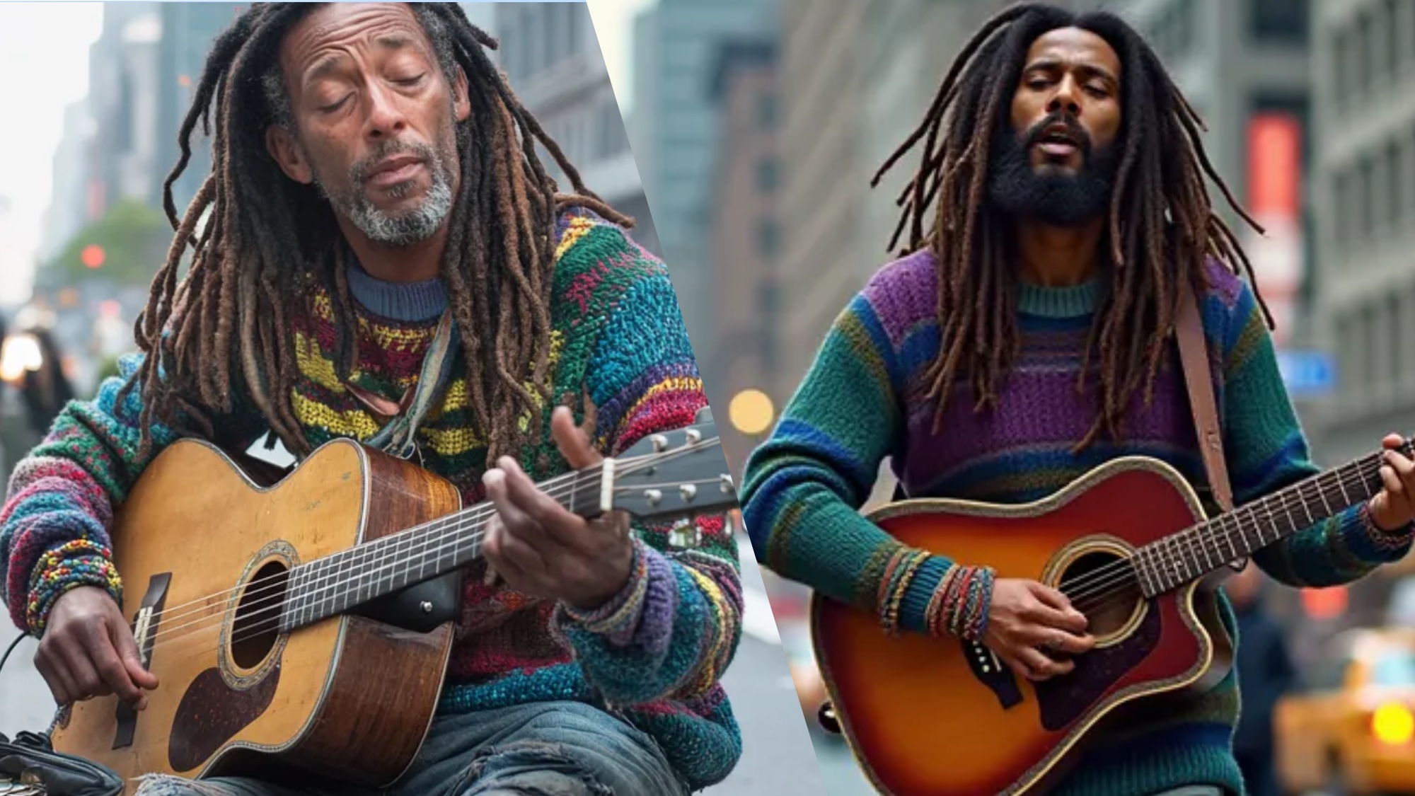
Deep Guide · June 2026
Why everyone who calls AI image generation “easy” is measuring the wrong thing — and a professional framework that actually transfers across Midjourney, Flux, and SDXL.
A prompt, in common usage, means a short cue. “Give me something to react to.” That’s the wrong mental model for AI image generation — and that mismatch explains why most first-time outputs are either accidentally good or consistently mediocre.
What you’re actually writing is a brief. A creative brief specifies subject, context, light source, mood, compositional intent, and technical constraints. It exists not to inspire an AI but to constrain it. The difference in output quality between a 12-word prompt and a structured 60-word brief isn’t marginal. It’s the difference between a stock photo and a commisssioned image.
This guide covers what the brief actually needs to contain, why that varies by model, and the specific mechanical decisions — lighting physics, camera simulation, negative prompt strategy — that most explainers skip because they look technical and unappealing. They’re the part that matters most.
Part One
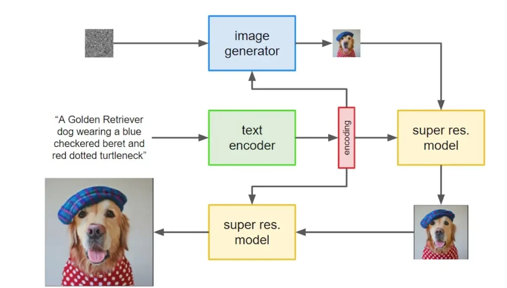
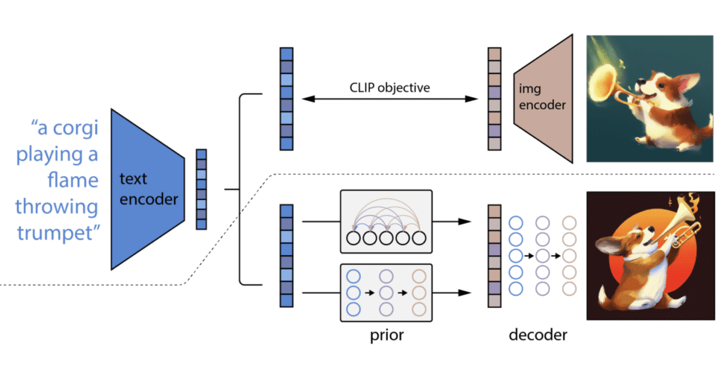
Diffusion models don’t process text the way a language model does. They don’t reason about your prompt. They convert language into a statistical map of visual features, then iteratively denoise random noise until an image matches that map. That process is entirely different from a poet reading your description and deciding what to draw.
The practical consequence: word order, specificity, and term provenance all affect output in ways that don’t match linguistic logic. Writing “a woman standing in a forest, melancholy, late afternoon” produces a different result from “late afternoon forest, melancholy woman standing” — not because the AI understood either one differently, but because the token weighting during CLIP encoding assigns different visual salience to each arrangement.
“Stop treating the AI like an illustrator and start treating it like a combination of a casting director, a cinematographer, and a lighting technician.”
— ImprovePrompt.ai Engineering Team, March 2026Here’s the deeper correction: not all diffusion models use the same text encoder. Midjourney v7 and Flux 2.0 use fundamentally different encoding architectures, and their prompt syntax preferences diverge in ways that most guides don’t mention because the guides were written when only one model was dominant.
Flux 2 Pro processes your prompt with near-literal fidelity. It reads long natural-language sentences. It follows spatial instructions (“the candle is in the lower left foreground”). It doesn’t add mood enhancement you didn’t ask for. What you write is what you get — which is either excellent or frustrating depending on whether you know what you actually want.
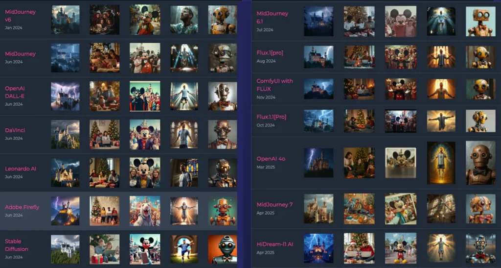
Midjourney v7 does the opposite. It interprets. It adds cinematic color grading, soft diffusion, and aesthetic coherence you didn’t specify. That’s why it’s the easiest model to get a beautiful result from in one try — it’s making creative decisions for you. The tradeoff: getting a specific result, rather than a beautiful-but-vague one, is harder. More on Midjourney-specific prompt patterns here.
SDXL sits between them, with one critical constraint that most guides bury in a footnote: it clips inputs at 75 tokens. Write a 120-word prompt in SDXL and the second half simply doesn’t register. Flux handles those long descriptions without a token ceiling.
Part Two
Every professional-grade AI image prompt can be decomposed into six discrete layers. None of them are optional. Each layer addresses a different subsystem in how the model renders an image. Here’s the anatomy:
Subject
Who or what
The main element, described specifically. Not “woman” — “35-year-old ceramicist, hands coated in wet clay, direct eye contact.”
Scene
Where and when
Environment, time of day, weather. The model needs spatial anchors to avoid generic floating subjects.
Lighting
Source + quality
The single highest-leverage variable. No light spec = model guesses. Specifying it changes everything.
Camera
Lens + aperture
Simulates physical optics. 85mm f/1.8 = portrait compression and shallow DOF. 24mm f/11 = architectural sharpness.
Style
Aesthetic direction
Medium, movement, reference aesthetic. Don’t say “cinematic” — say “Kodak Portra 400 grain, 1970s European film palette.”
Negative
What to suppress
Structural boundaries against artifacts. Less needed in Flux and MJ v7; still worth setting in SDXL pipelines.
The most common mistake: writing only subject and style, skipping lighting entirely. Lighting accounts for more perceived quality variance than any other single variable. A poorly lit subject with a great camera spec still looks like an AI image. A simply-described subject with precise lighting can look like a production photograph.
There are approximately seven lighting configurations that AI image models have strong internal representations of, because they appear frequently in training data under consistent terminology. Using their correct names invokes those representations reliably. Using vague synonyms (“nice light,” “warm glow,” “good lighting”) does not.
| Lighting Type | What it does to the image | Best used for | Avoid when |
|---|---|---|---|
| Rembrandt lighting | Small triangle of light under one eye; strong shadow on opposite cheek | Portraits, character studies, anything needing depth and gravitas | Product shots where you need even surface detail |
| Golden hour backlight | Warm rim light, lens flare potential, subject slightly silhouetted | Outdoor lifestyle, editorial, romance | Technical/clinical subjects; the warmth can feel wrong |
| Cinematic rim lighting | Edge separation from background, dramatic depth, often cool vs warm contrast | Sci-fi, thriller, editorial hero shots | Natural/pastoral subjects where artificiality breaks mood |
| Volumetric god rays | Visible light shafts through atmosphere — dust, fog, mist | Interior architecture, forest scenes, spiritual/dramatic themes | Controlled studio environments where atmospheric scatter looks wrong |
| Diffused overcast | Even illumination, no harsh shadows, reduced dynamic range | Product photography, skincare, food, anything detail-dependent | Dramatic or emotionally charged scenes — flatness kills mood |
| Chiaroscuro | High contrast between light and dark regions, deep shadows | Fine art, Renaissance-reference work, oil painting style | Light editorial or commercial contexts |
| Neon / practical lights | Colored illumination from diegetic sources: signs, screens, streetlights | Urban night scenes, cyberpunk aesthetics, nightlife | Anything requiring color accuracy — neon will contaminate your palette |
Specifying a lens focal length and aperture doesn’t tell the AI to make the image “look photographic.” It invokes the model’s representation of the physical optical behavior of that glass. An 85mm lens at f/1.8 doesn’t just create bokeh — it changes the compression of facial features, the depth separation between subject and environment, and the way background geometry blurs.
Lens reference quick guide
24mm f/8–f/11 — wide angle, deep focus, architectural and landscape use. Strong environmental context. Slight barrel distortion near edges.
50mm f/2.8 — “normal” perspective closest to human eye. Versatile. Slightly flattens depth compared to 35mm.
85mm f/1.4–f/1.8 — the portrait standard. Face compression, creamy background separation, minimal distortion. The model knows this spec extremely well.
135mm f/2 — more telephoto compression than 85mm, softer background transitions. Used for editorial and beauty work where the subject is strongly separated from environment.
Macro at 1:1 — extreme close-up reproduction. Product and nature. If you’re not showing this relationship, don’t specify it — the model will try to fill the frame edge-to-edge with texture.
Part Three
Most techniques transfer between models, but the format they work best in doesn’t. This is the source of most prompt frustration — people copy a Midjourney formula into Flux, get poor results, and conclude that one tool is inferior. The tool is fine. The syntax was wrong.
95%
Flux 2 Pro prompt adherence
Source: aitoolranked.com comparative testing, March 2026
85%
Midjourney v7 prompt adherence
Remaining gap reflects intentional artistic interpretation
97%
Flux hand accuracy in portraits
vs. 82% for Midjourney (controlled portrait tests, mid-2026)
75
SDXL token ceiling
Content past token 75 is silently ignored by the text encoder
| Model | Preferred prompt format | Negative prompt behavior | Best used for |
|---|---|---|---|
| Flux 2 Pro | Full natural-language sentences. “A ceramicist working at her wheel in morning light, studio walls visible behind her, 85mm lens, diffused north window lighting” works exactly as written. | Less impactful than in SDXL. Positive precision often makes negatives redundant. Still worth a baseline suppression string for volume work. | Photorealistic portraits, product photography, any output going in front of a client without post-processing |
| Midjourney v7 | Descriptive phrases, not necessarily grammatically complete. Style references and mood words carry more weight than in Flux. Appending --ar 3:2 --style raw suppresses some automatic enhancement. |
No traditional negative prompt field. Use --no [element] syntax. Works for removing specific objects, less effective for suppressing stylistic tendencies. |
Editorial, concept art, aesthetic mood boards, anything where slight creative interpretation is welcome |
| SDXL + LoRA | Front-load the most important elements. The model weights tokens roughly in order. Subject and lighting in the first 30 tokens; technical specs and style in the following 45. | Most effective negative prompt system of the three. Baseline string matters here: “blurry, distorted, low quality, watermark, extra limbs, bad anatomy, ugly, deformed” as a starting floor, then add use-case suppressions. | Specialized style fine-tunes unavailable in other models. Inpainting and outpainting workflows. ControlNet for pose and depth control. |
| DALL·E 4 | Plain English, conversational. The model accepts follow-up correction (“make the background more muted”) in ways the others don’t. | No traditional negative prompt. Safety filtering is the dominant constraint; structural suppression is handled internally. | Iterative workflows where you want to refine via dialogue. Reliable baseline quality with less setup than Flux or SDXL. |
One practical decision worth making before generating a single image: is your primary constraint accuracy or aesthetics? If a client is comparing your output to a photograph, Flux. If a client is comparing it to editorial illustration, Midjourney. This isn’t a quality judgment — it’s a tooling decision, and conflating them wastes iteration cycles.
Part Four
Most beginners treat negative prompts as a garbage collector — a list of bad things to prevent. Professional workflow treats them as structural boundaries. The difference is whether you’re reacting to output failures or preempting model defaults.
Three distinct types of negative prompt content exist, and they work differently:
Reactive negatives — least effective
"no weird face, don't make it ugly, avoid bad hands"
You’re describing what went wrong in the last output. The model doesn’t process “avoid bad hands” as an instruction to improve hand anatomy — it processes the word “hands” and sometimes makes hands more prominent.
Structural suppression — most effective
"blurry, distorted, low quality, watermark, extra limbs, disfigured, deformed, artifacts, jpeg compression"
These suppress known artifact categories at the model’s structural level. Think of them as turning off defaults, not providing feedback. Set once, use everywhere.
Style negatives in Midjourney — limited use
--no cartoon, --no illustration, --no painting
Work inconsistently. The model interprets these at generation time but its stylistic defaults reassert across seeds. Use --style raw + explicit style specification in the positive prompt instead.
Specificity over suppression — often better
"sharp focus on subject, clean background, anatomically accurate"
In Flux and modern MJ, stating what you want in positive terms (“anatomically correct hands, natural finger proportions, studio portrait”) often outperforms trying to suppress failure modes directly.
Baseline negative prompt for SDXL-family models
For volume work where consistency matters, a reliable starting floor: blurry, distorted, low quality, watermark, extra limbs, disfigured, deformed, bad anatomy, ugly, malformed hands, jpeg artifacts, oversaturated, chromatic aberration
Add use-case specifics on top. Product photography: add shadows on product, lens flare, background clutter. Portraits: add multiple people, double exposure, asymmetric eyes.
Part Five
“Cinematic” is probably the most common style descriptor in AI image prompts. It is also the least informative. Cinema covers Kubrick’s cold symmetry, Wong Kar-wai’s neon-soaked blur, Malick’s golden-hour naturalism, and Fincher’s blue-green clinical desaturation. They share nothing visually.
The models know all of those aesthetics. They don’t know which one you mean when you write “cinematic.” This is where specificity injection at the style layer pays off disproportionately. Instead of aesthetic adjectives, use the building blocks:
Instead of: “cinematic portrait”
Portrait of a 40-year-old architect, weathered hands, pensive expression,
standing in a half-constructed concrete building, dust in the air,
single practical light source from a work lamp to camera left, Rembrandt lighting ratio,
shot on 85mm f/1.4, medium format film simulation,
Kodak Portra 400 grain, desaturated blues and greens, warm skin tones preserved
Instead of: “beautiful fantasy landscape”
Ancient stone bridge over a narrow gorge, moss-covered, late autumn,
mist rising from the water below, dense deciduous forest on both banks,
golden hour backlighting, volumetric rays through the canopy,
wide angle 24mm f/8, maximizing depth of field and environmental context,
painterly realism, Studio Ghibli color palette influence, highly detailed foliage
Notice that neither prompt uses the words “cinematic” or “beautiful.” The qualities are built into the structural specifications. This is the professional approach: describe the cause (lens, light, grain, palette) rather than the effect (cinematic, beautiful, stunning).
Film stocks deserve specific mention because they’re among the most reliably invoked style references across all current models. Kodak Portra 400 (warm skin tones, moderate grain, compressed highlights), Fuji Velvia (saturated colors, fine grain, punchy contrast), and Kodak Tri-X (high-contrast black and white, visible grain structure) all produce consistent and distinguishable results when used as style anchors in Flux and Midjourney. The models have seen enough tagged photography to have robust representations of each.
Part Six
Single-image quality is a different problem from multi-image consistency. For projects requiring a visual series — editorial spreads, product families, character design across scenes — the generation workflow matters as much as prompt quality.
Four practical controls for consistency:
Seed locking. Every diffusion model accepts a seed value that initializes the random noise the image is generated from. Fixing the seed preserves base composition across prompt variations. It’s not a perfect tool — a significant prompt change will produce a different image even on a fixed seed — but for small iterative refinements, seed locking prevents the model from starting from a completely different visual premise each time.
Identical style descriptor language. The model has no memory between sessions. If your first image specified “Kodak Portra 400 grain, warm skin tones, 85mm lens” and your second omits the grain specification, the grain changes. Copy-paste your core style descriptor string across all images in a series rather than rewriting it each time.
CFG scale. In SDXL-family models, CFG (classifier-free guidance) scale controls how strictly the model follows the prompt versus allowing creative deviation. A CFG of 7 produces looser, more varied results; a CFG of 12–14 locks the model closely to the text but can produce over-saturated or slightly artificial output. For consistency across a series, use the same CFG value every time.
Flux Kontext reference images. Flux Kontext, available as of early 2026, accepts a reference image as a style anchor in addition to a text prompt. For character consistency specifically, this outperforms text-only style specification by a significant margin. I haven’t done controlled testing on this personally, but the practitioner reports are consistent enough to treat as reliable. See the Flux-specific prompt guide at BestPrompt.art for workflow details.
Part Seven
Before submitting a prompt, running this check takes about 45 seconds and eliminates the majority of wasteful iterations:
Pre-generation check
Subject specificity. Is there one concrete, described subject — or a vague category? “A scientist” fails. “A 50-year-old female biochemist looking into a microscope, white lab coat, tired expression” succeeds.
Light source named. Is there a specific lighting descriptor, or just a mood word? “Warm light” fails. “Rembrandt single-source studio lighting from camera left” succeeds.
Camera spec present. Is there a focal length and aperture, or nothing? In Flux and Midjourney, omitting camera spec means the model picks one. It usually picks 50mm f/5.6 equivalents — competent but undistinctive.
Style built or borrowed. Is the aesthetic direction grounded in a specific film stock, painter, or visual era — or is it an adjective like “beautiful” or “epic”? Adjectives are invitations to guess.
Negative prompt appropriate to model. For SDXL: structured suppression string present. For Flux/MJ: optional but worth having a baseline. For DALL·E: not applicable.
Part Eight
The gap between a first-time user and someone generating professional-grade output consistently isn’t creative vision. It’s mostly process. Here’s what the process actually looks like:
They build prompt templates, not prompts. A template contains fixed structural slots (lighting: [X], camera: [Y], style: [Z]) and variable slots (subject: [A], scene: [B]). Changing the subject and scene while preserving everything else produces a coherent visual series without starting from scratch each time. The template carries the aesthetic identity; the variables carry the content.
They curate aggressively. Professional AI image creators report selecting the top 10–20% of generations from any batch. This isn’t perfectionism — it’s the workflow expectation. Generating 5 images and expecting all 5 to be usable is the wrong frame. Generate 10, keep 2, build on those 2.
They keep a visual style guide. Before any project, they specify: primary color palette (not just “warm” — actual hex ranges), lighting character (not “dramatic” — specific named configuration), and compositional rules (not “interesting” — lens, framing, subject placement). This guide runs for the entire project. Drift from it, and the series loses coherence.
They use the right tool for the constraint. Photorealism with anatomical accuracy for a commercial client: Flux 2 Pro. Atmospheric editorial mood board where slight interpretation is welcome: Midjourney v7. Specialized style that only exists in the four-year-deep Stable Diffusion fine-tune ecosystem: SDXL with the right checkpoint. The instinct to run everything through one model because you know it is a consistency trap, not a best practice.
A note on prompt enhancers and auto-expand tools. Several platforms now offer prompt enhancement features that expand a short input into a more detailed prompt before generation. These work reasonably well for exploration but create a consistency problem: you can’t reproduce the same result unless you capture and reuse the exact expanded prompt. If you’re working on a project that requires consistent output, write the full prompt yourself and treat it as a source-controlled artifact. Relying on auto-expansion for production work is borrowing trouble.
Closing
The constraint this entire guide can’t solve
Everything above assumes you know what you want to make. The prompt is a translation tool. It converts intent into model instruction. If the intent is unclear — a feeling you’re reaching for, a mood you’ve seen in other images but can’t name — no amount of prompt engineering closes that gap.
The practical implication: the fastest way to improve your AI image output is not to learn more about prompts. It’s to spend time looking at, describing, and cataloguing the actual visual work that resonates with you. Collect references. Name their lighting setups. Identify their film stocks. Write down their compositional decisions. Build a personal vocabulary before you build prompts.
The framework above is an empty vessel until you fill it with specific visual intent. That part is still yours to do.
More at BestPrompt.art
This guide is the structural foundation. For model-specific deep dives, the full prompt library and reference guides are available at BestPrompt.art — organized by use case, model, and output type.