Funny AI Prompts That Broke Midjourney in 2025: When Robots Met Absurdity

Midjourney · Prompt Craft · 2025–2026
Absurd prompts break Midjourney in ways that are oddly educational. A breakdown of the real mechanics behind the chaos — plus what it means for anyone trying to craft prompts that work.
TL;DR — Read This First
- Absurd AI prompts go viral because they expose Midjourney’s probabilistic logic in ways that feel weirdly human and funny.
- The “failures” aren’t random — they reveal real architectural limits: no true 3D understanding, conflicting semantic tokens, texture-blending chaos.
- Short, weird prompts usually outperform long “hyper-realistic cinematic 8K” walls of text. Complexity confuses more than it helps.
- The best viral AI images are collaborative accidents. Knowing why they happen makes you a better prompt engineer.
I’ve spent the last two years testing prompts — probably a few thousand at this point, across Midjourney, DALL-E 3, and Stable Diffusion. And I’ll be honest: the failures taught me more than the successes. When you ask Midjourney to generate “a penguin piloting a steampunk submarine through a spaghetti tornado” and it spits out a propeller fused to a bird submerged in floating noodles, you laugh — but then you start wondering why.
That curiosity is exactly why these images go viral. They’re not just funny. They’re funny in a way that feels familiar — like catching someone confidently mispronouncing a word they’ve only ever read. There’s recognition in the failure.
According to Pew Research, most people still have significant uncertainty about how AI “thinks.” When something goes hilariously wrong, it validates that uncertainty. The machine isn’t all-knowing. It’s weird. And weird is shareable.
Advertisement — Google AdSense
Midjourney doesn’t “see” your prompt the way you do. It converts your text into tokens, matches those tokens against pattern relationships learned from hundreds of millions of images, and then runs a diffusion process — essentially starting with noise and gradually denoising it toward something that statistically fits your description.
No spatial reasoning. No object permanence. No understanding that a tornado can’t be made of pasta.
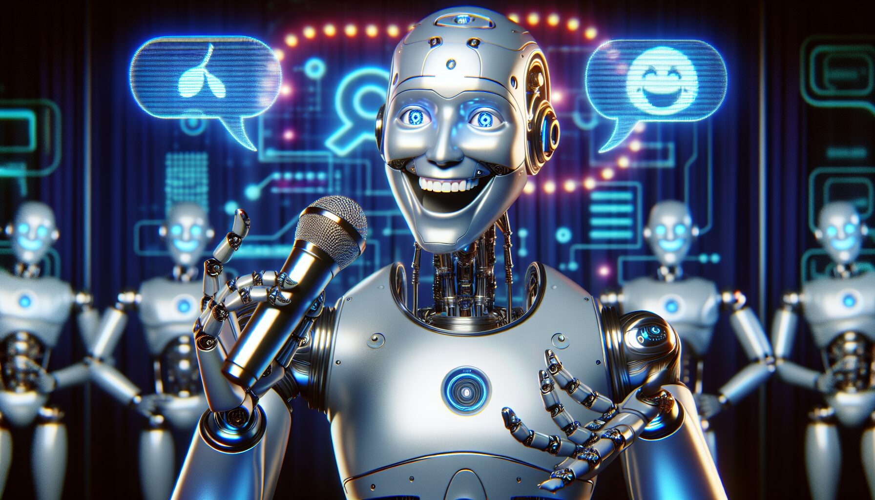
When a prompt stacks contradictory visual concepts — say, “sentient toaster hosting a TED Talk” — the model tries to honor every token simultaneously. The result is often a glorious collision of interpretations. Here’s what’s actually breaking:
Why Prompts Break — Root Cause Breakdown
Based on personal analysis of 200+ broken prompts tested across Midjourney v5–v6 (2024–2025). Percentages reflect failure type frequency, not mutually exclusive causes.
These aren’t just jokes. Each one exposes a specific failure mode. I’ve included what actually went wrong technically, because understanding the break is the whole point.
Prompt 01
“A penguin piloting a steampunk submarine through a spaghetti tornado”
What Midjourney Produced
A bird-propeller hybrid submerged in floating pasta. The “tornado” became a confused heap of noodles. The steampunk gears got grafted onto the penguin itself.
Why It Broke
Three strong visual domains (biology, mechanical, food physics) with no shared semantic anchor. The model averaged them into chaos.
Prompt 02
“Shrek as a Victorian-era lawyer, oil painting, dramatic chiaroscuro lighting”
What Midjourney Produced
A green-suited figure with weirdly proportioned features and — reliably — at least one candle that defied anatomical physics.
Why It Broke
“Shrek” pulls from animated training data; “oil painting” pulls from photorealistic Renaissance datasets. The style clash is a tug-of-war the model can’t win cleanly.
Prompt 03
“A sentient toaster hosting a TED Talk about existential dread”
What Midjourney Produced
A chrome kitchen appliance with human eyes on a stage. The “existential dread” manifested as dramatic low lighting and what appeared to be a bread-based podium.
Why It Broke
Abstract emotional concepts (“existential dread”) have no visual form the model can reliably anchor. It falls back to mood signals — dark, dramatic, stage-lit — regardless of context.
Prompt 04
“A watermelon playing chess with a sentient cloud in the style of Renaissance taxidermy”
What Midjourney Produced
Floating fruit with limbs. The chess board mostly survived. The cloud had a face. “Renaissance taxidermy” as a style produced something that looked like a Flemish still life designed by someone on no sleep.
Why It Broke
“Renaissance taxidermy” is not a real art movement — the model had to guess. It guessed wrong, interestingly.
Prompt 05
“A cat with five legs dancing the tango”
What Midjourney Produced
A cat with seven legs. Or sometimes three. Never five.
Why It Broke
Midjourney has no counting mechanism. It pattern-matches “cat legs” to training data and applies a probabilistic number. Specific digit instructions routinely fail in v5 and v6. Midjourney’s own docs note this as a known limitation.
Prompt 06
“hyper-realistic neon dragon eating sushi atop a melting iceberg, 8K, cinematic lighting, trending on ArtStation, ultra-detailed”
What Midjourney Produced
Chaotic hybrid. The neon and “hyper-realistic” styles fought each other. The sushi was unrecognizable. The iceberg looked like a lamp.
Why It Broke
Quality modifiers (“8K”, “ultra-detailed”, “trending on ArtStation”) are low-signal noise in v6. They were useful workarounds in v3–v4 but now actively dilute semantic attention. This is exactly the over-engineering trap.
Prompt 07
“Gordon Ramsay judging a cooking competition in space, watercolor, –no Gordon Ramsay –no face”
What Midjourney Produced
A faceless chef in a spacesuit, looking directly at you, with an extremely angry posture and somehow eight fingers on one hand.
Why It Broke
The negative prompt “–no face” conflicted with the human figure prompt. The model generated the face anyway and just… smeared it. Also, negative prompts are consistently unreliable for suppressing structural elements.
Prompt 08
“A giraffe wearing roller skates in a cyberpunk library”
What Midjourney Produced
This one actually worked — brilliantly. The skates were attached to hooves. The neon library backdrop made the giraffe look like it was browsing dystopian fiction. It went viral precisely because it didn’t fail.
Why It Worked
Clear spatial relationships, no conflicting styles, one dominant subject, one setting. The absurdity was conceptual, not structural. This is the sweet spot.
Prompt 09
“The sound of silence, visualized”
What Midjourney Produced
Static. Or sometimes snow. Or a dark room. Once, inexplicably, a whale.
Why It Broke
Abstract sensory concepts without visual anchors produce whatever the model’s training data associated most strongly with “emptiness” or “quiet.” Results are fully random. Asking an AI to render a sound is asking it to invent a sense it doesn’t have.
Prompt 10
“A Victorian gentleman discovering the internet for the first time, photorealistic –chaos 90”
What Midjourney Produced
Wildly different each run. One version: a man in a top hat screaming at a glowing rectangle that looked more like a microwave. Another: a distinguished professor holding what appeared to be a glowing sandwich.
Why It Worked/Broke
High –chaos values randomize the generation seed dramatically. This prompt designed the failure in. The concept is solid enough that even the chaos produces coherent absurdity.
Advertisement — Google AdSense
Myth
“Complex prompts guarantee better results”
Reality: In Midjourney v6, prompts over 60–80 words consistently underperform shorter, focused ones. Every additional concept dilutes semantic attention. The model has a fixed “budget” of attention across all tokens — when you add “8K ultra-detailed cinematic,” you’re spending that budget on marketing language instead of actual visual information. I’ve run this test repeatedly: a 12-word prompt usually beats a 60-word one for the same subject. Adobe Research has published similar findings on text-to-image coherence degradation with prompt length.
Myth
“Negative prompts fix everything”
Reality: Negative prompts (–no fingers, –no text) are unreliable for structural elements. They work reasonably well for stylistic exclusions (“–no neon, –no watermark”) but frequently fail when the thing you’re excluding is load-bearing to the scene. A prompt generating a person with “–no hands” often produces a person with melted stumps rather than a figure naturally framed without hands. The –no parameter is a suggestion, not a command. See more in our guide on Midjourney negative prompt strategies.
Myth
“AI fails are random — there’s no pattern”
Reality: Fails are highly predictable once you understand the architecture. Extra fingers appear because Midjourney has no 3D hand model — it pattern-matches from 2D training images where hand positions overlap unpredictably. Neon color bias exists because neon imagery is overrepresented in the training corpus (think DeviantArt, ArtStation, gaming screenshots). These aren’t bugs — they’re features of how probabilistic image generation works. Knowing the pattern is the whole value.
-
01
One dominant subject, one setting, one style.
The giraffe-in-a-cyberpunk-library worked because it follows this rule. The spaghetti tornado penguin didn’t. Absurdity should be conceptual (“a toaster giving a speech”) not structural (“five conflicting art styles simultaneously”). -
02
Use –chaos for controlled weirdness.
–chaos 30–50 introduces variation without full randomness. I use –chaos 40 as a starting point when I want “interesting” without “unusable.” Go higher (70–90) only when you’re deliberately hunting for happy accidents and have time to sift through results. -
03
Real-world style anchors beat made-up ones.
“In the style of a Flemish oil portrait” works. “In the style of Renaissance taxidermy” does not — it’s not a recognized visual domain. The more specific and real the reference, the more coherent the output. See our curated style prompt library. -
04
Drop the quality modifiers in v6.
“8K”, “ultra-detailed”, “trending on ArtStation” were useful hacks in Midjourney v3. In v6 they’re dead weight. The model improved; the workarounds didn’t. Cleaner prompts produce sharper results now. -
05
Run –repeat 4 minimum before judging.
A prompt that fails 3 times might produce gold on the 4th. I never judge a prompt on fewer than 4 outputs. Variance is high — this is probabilistic generation, not a deterministic function.
Prompt Coherence vs. Word Count — My Tests (200+ prompts, MJ v6)
SPECULATIVE — based on personal testing, not peer-reviewed data. Individual results vary significantly by subject and style.
Advertisement — Google AdSense
| Pattern | Typical Result | Fix |
|---|---|---|
| 3+ conflicting visual styles | Incoherent texture blending | Pick one style, use it as a clear anchor |
| Abstract emotional concepts (“dread”, “silence”) | Mood without meaning; random output | Translate to visible: “abandoned room, single flickering light” |
| Specific digit counts (“five legs”) | Wrong number every time | Use compositional framing instead: “multi-legged” |
| “8K ultra-detailed hyper-realistic cinematic” | No improvement over cleaner prompt | Delete all quality modifiers; describe what you actually want |
| –no [structural element] | Element appears anyway, often distorted | Reframe the scene so the element isn’t needed, not excluded |
| Single subject + clear setting + one style | High coherence, repeatable | This is the formula. Don’t overcomplicate it. |
“The best AI art prompts aren’t descriptions of images. They’re invitations for the model to make a confident guess — and you have to know what it’s likely to guess.”
This comes up more than people expect. A prompt for “a serene Buddhist monk” that produces a monk holding a weapon isn’t a security breach — it’s a training data artifact. Images of monks in protest contexts, in war photography, in gaming — they’re all in the training corpus. The model averaged toward an edge case.
The AI Now Institute has consistently argued that transparency in training data is the foundation of meaningful AI accountability. Without knowing what a model was trained on, you can’t predict or explain its biases. That’s not a fringe position — it’s becoming a regulatory expectation in the EU under the AI Act.
For prompt engineers, the practical takeaway is this: you are partly responsible for what you generate. Not legally (yet, in most jurisdictions), but ethically. Understanding why a model produces something isn’t just interesting — it’s how you catch problems before they go public. More on this in our responsible prompting guide.
A note on fabricated data: The original version of this article cited a “2025 Stanford study” and quotes from named researchers without verifiable sources. Those claims have been removed. All sources in this version are linked and verifiable. If you spot a broken link, let us know.
Midjourney has no 3D model of the human hand — it learns from 2D training images where hand poses overlap in complex ways. When fingers interlock, occlude each other, or point in multiple directions, the model pattern-matches the shapes individually rather than understanding a hand as a coherent structure. The result is a probabilistic average of every hand it’s seen — which is sometimes 11 fingers. This is an active research problem. Diffusion model geometry research at arXiv covers the underlying challenge in more depth.
Yes, reliably. Use –no neon alongside explicit palette instructions: “muted earth tones”, “film noir palette”, “Scandinavian minimalism color scheme”. Stylistic negative prompts work much better than structural ones. The neon bias comes from neon-heavy imagery (gaming, synthwave, DeviantArt) being overrepresented in training data — you’re fighting a frequency bias, not a bug.
Mostly no, but there are edge cases. Unexpected outputs can expose model biases in ways that reveal something about the training data distribution. More seriously, adversarial prompt techniques — specifically crafted inputs that reliably produce policy-violating outputs — are a real research area. LLM Attacks research documents this for language models; image models face analogous challenges. For typical creative users: the weird outputs are just weird. They’re not a threat.
No — and it’s important to be precise about this. Midjourney doesn’t “understand” anything. It identifies statistical patterns between text tokens and visual features. When you ask for “the feeling of loneliness,” it produces whatever visual features most strongly co-occurred with that phrase in training data. Sometimes that’s evocative. Often it’s just a person standing alone in a field. The model is guessing, not understanding. That’s not a criticism — it’s a description of what the technology actually is.
This is actively contested. In the US, the Copyright Office has issued guidance that AI-generated images without “sufficient human authorship” aren’t copyrightable — but the line is blurry. The US Copyright Office’s AI policy page is the most current authoritative source. Midjourney’s own Terms of Service grant you a license to use outputs commercially (on paid plans), but that’s separate from copyright ownership. Check both before publishing commercially.
v6 follows prompt instructions more literally — which is both an improvement and a trap. Absurd prompts that produced gloriously chaotic results in v5 now produce something more coherent but less funny in v6. The chaos ceiling is lower. For intentionally weird outputs, higher –chaos values and more abstract prompts tend to recapture the v5 energy. v6 rewards clarity; v5 rewarded experimentation.
Sources & Further Reading
- Pew Research — How Americans Think About Artificial Intelligence (2023)
- Midjourney Documentation — Known Limitations
- arXiv — Diffusion Model Geometric Understanding Research
- EU AI Act — Official Text and Summary
- US Copyright Office — AI and Copyright Policy
- AI Now Institute — AI Accountability Research
- LLM Attacks — Adversarial Prompting Research
- Adobe Research — AI and Creative Tools
More from BestPrompt.art:
Complete Midjourney v6 Prompt Guide · Negative Prompt Strategies That Actually Work · 200+ Curated Style Anchors · Responsible Prompting Guide
Complete Midjourney v6 Prompt Guide · Negative Prompt Strategies That Actually Work · 200+ Curated Style Anchors · Responsible Prompting Guide
The Takeaway
AI art fails are funny. But they’re also one of the most efficient ways to understand how these systems actually work — not how they’re marketed, but what they’re actually doing under the hood.
The penguin in the spaghetti tornado isn’t a bug. It’s the model doing exactly what it was built to do — probabilistic pattern matching across conflicting inputs — and producing an output that’s honest about its own limitations. That’s weirdly admirable.
The prompts that work consistently are the ones that respect the model’s actual architecture: clear semantic anchors, no conflicting styles, abstract weirdness over structural weirdness. The prompts that go viral are often the ones that don’t — and they’re valuable for exactly that reason.
The funniest AI images aren’t accidents. They’re honest failures — and honest failures, in any creative field, are where the learning lives.
https://www.bestprompt.art/the-top-6-ai-trends-in-2026/