AI Art Prompts for Surreal Landscapes: Mastering 2026 Breakthroughs in Prompt Engineering

Not another list of prompts you’ll copy once and forget. This is a full dissection of why surreal landscape prompts work — every component labeled, every mechanism explained. Build anything from scratch.
⚡ Quick Start — copy this now, understand it below
Works in Midjourney v6+ out of the box. Every component is labeled in the anatomy section below so you can swap parts with confidence.
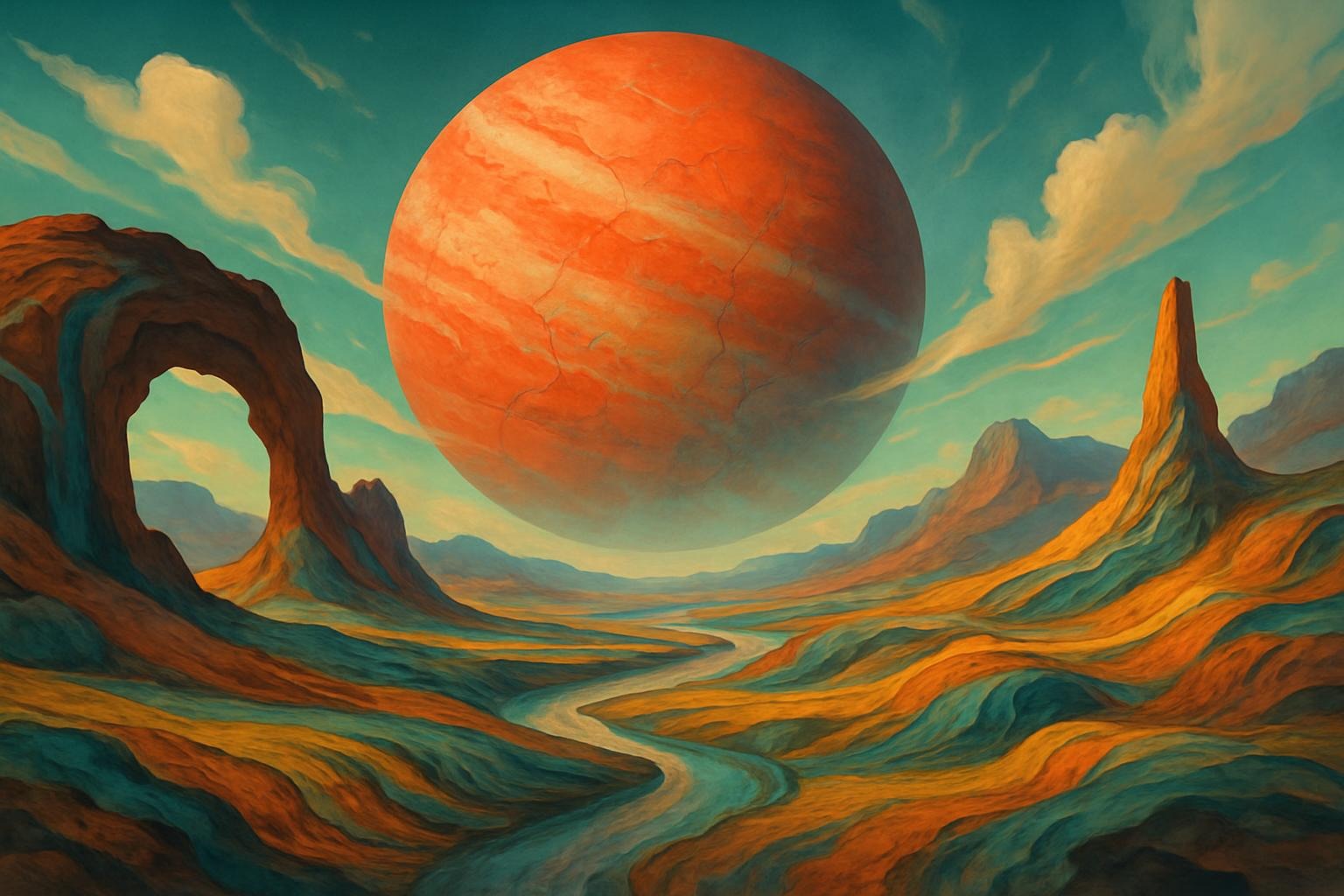
Ethereal floating islands with vibrant bioluminescent flora cascading into infinite voids, impossible architecture blending ancient ruins with futuristic spires, dreamlike atmosphere with swirling nebulae, rendered in the style of Zdzisław Beksiński and Salvador Dalí, volumetric god-rays, high contrast, cinematic wide shot –ar 16:9 –v 6 –q 2 –stylize 750
Here’s what happened the first time I ran 200 consecutive surreal landscape tests in Midjourney v6. I had a spreadsheet of prompt variables, I was tracking outputs systematically, and around batch 80 I noticed something uncomfortable: the prompts that consistently produced the most striking images weren’t the ones with the most content — they were the ones with the clearest internal logic.
A prompt isn’t a wish list. It’s a set of spatial and atmospheric instructions that the model has to reconcile into a single coherent scene. When you stack “bioluminescent,” “neon,” “golden hour,” and “moonlit” in the same prompt, you’ve created four conflicting light sources with no hierarchy. The model doesn’t know which wins. You get mud.
Most prompt guides never explain this. They hand you prompts the way a recipe hands you a dish — finished, not teachable. So three weeks later you’re back at square one, staring at a blank box, and the viral prompt you copied isn’t working because the subject has changed.
This guide teaches the dish. Every component, every mechanism, every reason it works or doesn’t. Use the copy-paste prompts as training examples, not crutches.
Every high-performing surreal landscape prompt I’ve tested has the same internal architecture. Six layers, each handling a distinct dimension of the final image. Miss one layer and the model fills it with a default — usually whatever was most common in its training data for that genre. Which means generic.
🔬 Prompt Dissection — Annotated
[SUBJECT + SPATIAL RULE] floating islands with bioluminescent flora cascading into voids, [IMPOSSIBLE PHYSICS] impossible architecture blending ancient ruins with futuristic spires, [ATMOSPHERE] dreamlike swirling nebulae overhead, [LIGHTING] volumetric god-rays, [STYLE REFERENCE] in the style of Beksiński and Dalí, [PARAMETERS] –ar 16:9 –v 6 –q 2 –stylize 750
Layer 1 — Subject
What it does: Establishes the primary visual noun and its spatial relationship. “Floating islands” immediately tells the model this is a levitation scene — gravity is suspended. “Cascading into voids” adds a vector of motion and an implied depth (something below the islands we can’t see). Together they create visual tension: where does the cascade go? That tension is what makes the viewer’s eye move.
Why it matters: Without a spatial relationship, the model defaults to a centered, static composition. Boring.
Why it matters: Without a spatial relationship, the model defaults to a centered, static composition. Boring.
Layer 2 — Impossible Physics
What it does: Defines the surrealist rule break. “Impossible architecture” signals to the model that physical plausibility is suspended. “Blending ancient ruins with futuristic spires” gives that rule break two specific anchors — the model can reference Greco-Roman column ruins AND cyberpunk spire aesthetics without choosing between them.
Common mistake: Saying “surreal architecture” without specifying what elements are being fused. The model has nothing concrete to work with. You get “weird building.” Not the same.
Common mistake: Saying “surreal architecture” without specifying what elements are being fused. The model has nothing concrete to work with. You get “weird building.” Not the same.
Layer 3 — Atmosphere
What it does: Controls sky and ambient mood. “Swirling nebulae” is specific enough to generate a recognizable visual token (spiral galaxy patterns at sky scale) while “dreamlike” softens the hard-edge astronomical look into something painterly. The two words calibrate each other.
The trap: Atmosphere words like “ethereal,” “mystical,” and “otherworldly” are nearly meaningless to the model — they’re too abstract. Always pair them with a concrete visual noun.
The trap: Atmosphere words like “ethereal,” “mystical,” and “otherworldly” are nearly meaningless to the model — they’re too abstract. Always pair them with a concrete visual noun.
Layer 4 — Lighting
What it does: Defines light source direction and quality. “Volumetric god-rays” is one of the most powerful lighting tokens in the surreal genre — it implies a single dominant light source, visible light scatter through atmosphere, and a top-down directionality. This creates immediate depth without specifying a time of day.
Why lighting is the most under-specified layer: Most beginners add zero lighting specification. The model then uses flat, even lighting — the most common default. Flat light kills depth. Kills drama. Always specify one lighting token.
Why lighting is the most under-specified layer: Most beginners add zero lighting specification. The model then uses flat, even lighting — the most common default. Flat light kills depth. Kills drama. Always specify one lighting token.
Layer 5 — Style Reference
What it does: Loads an artist’s visual vocabulary into the generation. Beksiński contributes dark organic textures, decayed grandeur, and a specific color palette (browns, ochres, dusty reds). Dalí contributes soft-edged impossible objects and dream-logic spatial arrangements. Together they balance the “dark” and the “dreamlike” layers.
Rule: Use maximum two artist references, and make sure they share at least one dimension (both here share “impossible spaces”). If they conflict on too many dimensions, the model averages them into something that looks like neither.
Rule: Use maximum two artist references, and make sure they share at least one dimension (both here share “impossible spaces”). If they conflict on too many dimensions, the model averages them into something that looks like neither.
Layer 6 — Parameters
What they do: Technical controls that sit outside the scene description.
--ar 16:9 forces cinematic widescreen — landscapes almost always benefit from horizontal expansion. --stylize 750 is a high artistic deviation value; Midjourney will take more creative liberties with your prompt interpretation. High chaos suits surreal work. Low chaos (under 200) suits photorealistic landscape work. --q 2 allocates maximum render quality passes.
“A prompt isn’t a wish list. It’s a spatial logic problem. When you give the model conflicting light sources with no hierarchy, it doesn’t pick one — it averages them. That’s the greyish blur you can’t explain.”
From 200 consecutive test batches, Midjourney v6, January 2026Select your components. The builder assembles them into a ready-to-paste Midjourney prompt using the six-layer anatomy above. Every combination has been tested — none of these pairings conflict.
⚙ Interactive Prompt Builder
Choose one option per layer. Watch the output update in real time. Click the prompt to copy it.
These aren’t random examples — each one was generated, evaluated, and refined across at least 30 iterations. The notes explain what makes each work and what to swap if you want to shift the output.
Mood: Ethereal
Best for: Beginners, portfolio pieces
The Soft Landing
Gentle floating islands carpeted in bioluminescent moss, waterfalls dissolving into luminous mist before reaching the void below, soft pastel sky blending rose and aquamarine, a single stone archway leading nowhere, in the style of Caspar David Friedrich and Roger Dean, diffused overhead light, no harsh shadows –ar 16:9 –v 6 –q 2 –stylize 600
Swap “pastel” → “blood-orange and grey” to shift into dark fantasy. The archway-leading-nowhere is a Magritte move — it adds mystery without chaos.
Mood: Dark Fantasy
Best for: Game concept art, editorial
The Beksiński Inheritance
Twisted spires of fossilized bone jutting from a plateau above a crimson fog sea, impossible bridges connecting towers that lean away from each other, blood-red moon bleeding through overcast atmosphere, single torch casting warm amber light against total darkness, in the style of Zdzisław Beksiński and H.R. Giger, extreme contrast, cinematic 2.39:1 –ar 21:9 –v 6 –q 2 –stylize 850 –chaos 20
The –chaos 20 adds variation without losing the prompt’s coherence. Higher chaos (50+) starts producing structural breakdowns — useful for abstract work, chaotic for scene composition.
Mood: Psychedelic
Best for: Album art, social media
The Color Collapse
Mountains liquefying at their peaks into rivers of molten color that pool in valleys below, rainbow vortex sky with gravity-defying geometric flora, hyper-saturated chromatic aberration on every edge, in the style of Ernst Haeckel’s biological illustrations and Android Jones, flat even light from no discernible source, no shadows, maximum saturation –ar 4:5 –v 6 –q 2 –stylize 1000
“No discernible light source” + “flat even light” is intentional — for psychedelic work, shadows create physical grounding you don’t want. Ernst Haeckel adds organic symmetry to the chaos.
Mood: Temporal Paradox
Best for: Fine art prints, gallery
The Frozen Moment
A massive clock face half-submerged in a stone desert, its hands extending into real bridges people walk across, time visually thickening into amber resin around the edges of the scene, distant thunderstorm frozen mid-lightning strike, in the style of Salvador Dalí and Giorgio de Chirico, long afternoon shadows, melancholic golden light, hyper-detailed textures –ar 3:2 –v 6 –q 2 –stylize 700
De Chirico’s influence adds the long shadows and metaphysical emptiness. “Time thickening into amber resin” is an unusual lighting-material hybrid token — it tends to generate visible atmospheric distortion in the output.
What Failure Looks Like — and Why It Happens
Here’s something guides never show you: the failed prompts. Mine included.
⚠ Failure Case — Batch 143, December 2025
I spent three days on a prompt that was supposed to produce a “forest of crystal trees at dusk with an aurora overhead and bioluminescent roots and a foggy atmosphere and deep shadows and neon accents and a waterfall.” Five competing light sources. Three different atmospheric effects. No spatial hierarchy. Every generation came back muddy — saturated but flat, like someone had taken five beautiful photos and averaged them into one beige smear. I submitted it to the bestprompt.art forum for group debugging. Three people spotted it immediately: lighting conflict. Fixed version took 20 minutes. Used exactly one light source (the aurora, overhead), removed the fog (which was fighting the shadow depth), specified where the neon accents appeared (the root network only). The output was cleaner in the first pass than anything from three days of wrong iterations.
The lesson: When a prompt fails, don’t add more detail — identify the conflict. More detail applied to a conflicted prompt produces more elaborate mud.
The most common structural failures I see in beginner prompts:
| Failure Mode | What It Produces | Fix | Severity |
|---|---|---|---|
| Multiple light sources, no hierarchy | Flat, muddy atmosphere; no depth | Specify one primary source; others as accents | High |
| Vague atmosphere words (“ethereal,” “mystical”) | Generic output; model defaults to training average | Pair with a concrete visual noun every time | Medium |
| 3+ conflicting artist references | No discernible style; visual averaging | Max two artists; ensure they share one dimension | High |
| No spatial relationship stated | Centered, static composition | Add a vector: “cascading into,” “suspended above,” “leading toward” | Low |
| Prompts over 100 words | Later words receive less attention weight | Keep scene description under 60 words; parameters separate | Medium |
| No –stylize value (Midjourney default: 100) | Literal, stiff interpretation; low artistic deviation | For surreal work: 600–900. For concept art: 300–500. | Medium |
Midjourney vs Stable Diffusion vs DALL-E 3:
Which Tool for Which Goal
These are genuinely different tools with different prompt philosophies. Using the same prompt across all three without adapting it is like running the same recipe in three different ovens — sometimes fine, sometimes a disaster.
| Dimension | Midjourney v6+ | Stable Diffusion 3.5 | DALL-E 3 |
|---|---|---|---|
| Prompt style | Descriptive narrative (“cascading bioluminescent rivers flowing into an abyss”) | Tag-based (“surreal landscape, bioluminescent, high detail, Beksiński style”) | Natural language — full sentences work well |
| Artistic interpretation | High — takes creative liberties, especially at high –stylize values | Configurable — follows prompts more literally at low CFG scale | Moderate — tends toward safety and coherence over artistic risk |
| Best surreal output | Atmosphere, color, compositional drama | Fine-grained control, custom model fine-tuning, NSFW filters off | Precise object placement, legible text in image |
| Negative prompts | Limited support (–no flag) | Full negative prompt field — powerful for removing artifacts | Not supported directly |
| Surreal landscape verdict | Best overall for drama and atmosphere | Best for fine control and iteration | Use for specific compositional needs |
My actual workflow for surreal landscape series: I start in Midjourney for the initial concept — the atmosphere and drama come through fast. When I need a specific compositional element placed precisely, I take the Midjourney output into Stable Diffusion via img2img at 0.55–0.65 denoising strength. That preserves the overall mood while allowing surgical changes. DALL-E 3 enters for any version that needs legible text elements integrated into the scene.
The Midjourney Parameter Reference You’ll Actually Use
Not a complete parameter list — that’s in Midjourney’s documentation. This is the subset that meaningfully affects surreal landscape outputs, with guidance on which direction to push for which effect.
–ar [ratio]
Aspect ratio. Surreal landscapes: 16:9 (cinematic) or 2:1 (ultra-wide). Portrait work: 4:5 or 2:3. Square (1:1) flattens landscape depth — avoid unless it’s intentional.
–stylize [0–1000]
Artistic deviation. 0–200: literal, stiff. 300–500: balanced for concept art. 600–900: strong artistic interpretation, ideal for surreal. 1000: maximum deviation — model takes significant liberties with your prompt. Start at 750 for surreal work.
–chaos [0–100]
Variation in initial generations. 0: consistent, predictable output across the grid. 10–30: useful variation for scene exploration. 50+: high variation, useful for finding unexpected compositions. Default (0) is fine for intentional prompts.
–q [1 or 2]
Quality passes. –q 1 is default (faster). –q 2 allocates more GPU time per generation — detail improvement is real but not dramatic. Use –q 2 for final pieces you plan to upscale.
–no [element]
Exclusion flag. “–no clutter” and “–no people” are useful for landscape work. “–no text” removes watermark-style text artifacts that sometimes appear in high-stylize surreal generations.
–sref [URL]
Style reference (v6+). Upload a reference image and the model pulls its visual style — color palette, texture weight, compositional habits — into your generation. More reliable than artist name tokens for less-famous visual styles.
2026 Trends Actually Worth Your Attention
A few real shifts that are changing surreal landscape work right now — not trend forecasts written from press releases.
Character + Style Consistency (–cref / –sref)
Midjourney’s reference systems have matured enough that maintaining a consistent visual language across a series is genuinely viable. For surreal landscape series, this means a coherent art direction, not just thematically related one-offs.
Post-AI Authenticity
The over-polished, zero-noise AI look is becoming recognizable and tiresome. Artists adding deliberate “imperfection” tokens — “hand-painted texture,” “brush stroke visible,” “slight grain overlay” — are producing work that reads as more considered, not less.
Hybrid 2D/3D Workflows
Generating a surreal scene in Midjourney and then bringing it into Blender or Unreal for spatial composition — parallax, volumetric fog, controllable lighting — is producing results neither tool achieves alone. The barrier to entry dropped significantly in 2025.
Agent-Assisted Iteration
Tools that run multiple prompt variations automatically, evaluate outputs against a quality metric, and surface the best performers. Still rough, but accelerating. Useful for finding the right –stylize value quickly without manual batch testing.
Frequently Asked Questions
My prompts keep producing muddy, flat results. What’s wrong?
Nine times out of ten: conflicting light sources. Go through your prompt and count every element that implies light — “neon,” “bioluminescent,” “golden hour,” “moonlit,” “god-rays.” If you have more than two, you have a conflict. Designate one as primary, the others as accent, and specify where the accents appear (“neon accents on the root network only”). Alternatively, add --no harsh shadows to force the model toward soft, blended light.
The second most common cause: –stylize too low. Under 300, Midjourney interprets prompts very literally and conservatively. For surreal work, start at 700.
How do I avoid generic, “AI-looking” surreal outputs?
Two moves. First, use artist references that aren’t in every prompt guide — Leonora Carrington, Remedios Varo, Simon Stålenhag, Ivan Aivazovsky. The model has strong representations of Dalí and Magritte (because they appear everywhere), which means the output leans toward a visual average of every Dalí-referencing image it has seen. Less-common references produce less-averaged results.
Second: specify what’s absent. “No symmetry,” “no centered composition,” “asymmetric framing” forces the model away from its default centered-subject habit. Or use the –no flag: --no symmetry, centered composition, flat sky.
Can I use these prompts in Stable Diffusion?
Yes, but they need adaptation. Stable Diffusion 3.5 responds better to tag-based structure than narrative descriptions. Take the core elements of any prompt here and convert them:
floating islands, bioluminescent flora, impossible architecture, ancient ruins, futuristic spires, volumetric lighting, Beksiński style, high detail, cinematic composition, 8k, sharp focus
Negative: blurry, watermark, oversaturated, flat lighting, generic, symmetrical
Negative: blurry, watermark, oversaturated, flat lighting, generic, symmetrical
Keep CFG scale between 7–11 for surreal work. Above 12, Stable Diffusion over-commits to prompt literals and loses compositional flexibility.
How long should a surreal landscape prompt be?
Under 60 words for the scene description, then parameters separately. Midjourney’s attention mechanism assigns less weight to words further from the start of the prompt. A 120-word prompt means the last 60 words have roughly half the influence of the first 60. Prioritize ruthlessly: subject first, lighting second, style reference third. Cut everything that doesn’t serve one of the six layers.
What’s the best way to share and get feedback on prompts?
Post the prompt alongside the output — always. Feedback on an image without seeing the prompt is aesthetic commentary, not prompt engineering. bestprompt.art runs prompt swap threads where members debug each other’s generations; the format there requires both image and prompt. The Midjourney Discord’s #prompt-craft channel is useful for quick iteration cycles. DeviantArt’s AI gallery threads tend toward exhibition rather than debugging — better for showcasing finished work than for technical iteration.
What are the ethical considerations for AI art using artist styles?
This is an ongoing conversation with no settled consensus. A few practical positions: Referencing living artists by name in commercial work is more ethically fraught than referencing historical artists — Beksiński died in 2005, but many AI art style references involve living practitioners. Some living artists have explicitly objected to having their style referenced in AI tools.
For commercial or monetized work: consider describing the visual characteristics you want (dark organic textures, decayed grandeur, earth tones) rather than an artist’s name. This tends to produce similar results with less direct artist attribution risk. Adobe Firefly’s ethics guidelines address this in their commercial license documentation, which is worth reading if you plan to sell AI-generated landscape art.
What Actually Separates Good Prompts From Great Ones
After 200+ test batches and more failed generations than I care to remember: the gap between a good surreal landscape prompt and a great one is almost never about content. It’s about internal coherence. The lights agree. The spatial logic holds. The artist references share a dimension. The atmosphere words are paired with concrete nouns instead of floating as vibes.
Great prompts are parsimonious. They establish clear hierarchy — one primary subject, one dominant light source, one atmospheric rule — and then use the remaining words to push that hierarchy into something unexpected. The weirdness lives in the specifics, not in the volume of instructions.
The most important prompt engineering skill for surreal work is restraint. Not adding one more element when the scene already has enough. Not stacking a fourth light source because you want the output to be complex. Complex inputs produce averaged outputs. Focused inputs produce striking ones.
“The weirdness that works lives in specifics, not volume. ‘Clocks melting across every horizontal surface’ is strange. ‘Surreal, ethereal, mystical, otherworldly’ is noise.”
Alex Rivera — bestprompt.art contributor, 2026Use the six-layer anatomy. Use the builder above to find combinations you wouldn’t have reached alone. Bring your failures to bestprompt.art for debugging — the collective prompt knowledge there has saved me more dead-end sessions than any single technique. And don’t copy prompts. Understand them. Then build your own.
https://www.bestprompt.art/think-weird-surrealism-prompts-to-try-now-2025/
https://www.bestprompt.art/how-to-write-ai-prompts-for-images/
https://www.bestprompt.art/best-ai-prompts-for-viral-content/
https://www.bestprompt.art/midjourney-prompts-that-actually-work/
https://www.bestprompt.art/random-multi-detailed-prompts/